Visualizing Chicago Theft Data - An Experiment
“What story do I want to tell?”
That question lies at the heart of every visualization. After two things were stolen in my first two weeks in Cambridge, I got curious about thefts trends.
Questions help me clarify stories. In this case there are two:
- How does total theft in some areas compare to total theft in others?
- How does each area’s theft trend over time compare with others around it?
My initial intent was to map the two questions using Cambridge and/or Boston metro area data. The closest I found was a reference from the Cambridge data links page to some pre-made 2005 maps. Mapping the questions sounded fun despite Cambridge data availability issues (apparently a shared problem), so I went ahead using data from Chicago’s awesome city data portal The resulting map is on the right. (2017 Migration edit: In the interest of preserving a visual despite changing APIs, the map is now a static image instead of the actual code).
2003-2010 total Chicago thefts under $300 by ward
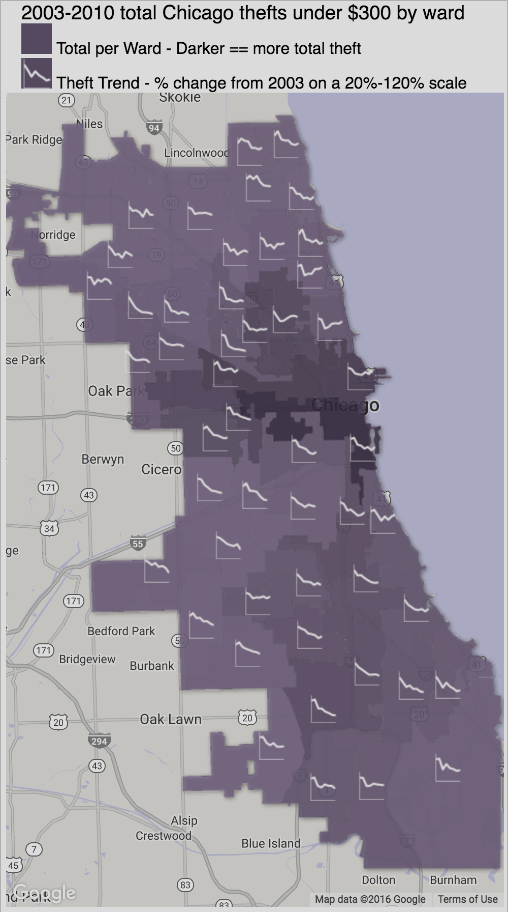
2003-2010 total Chicago thefts under $300 US dollars by ward and year, including ID thefts. Whether $300 is adjusted for inflation is unknown. Reporting procedures and other potential bias sources are also unknown. Excludes 2001-2002 due to irregular/infrequent entries, and a small number of entries lacking wards. From City of Chicago crime data view on 2011/09/22. Originally from 2001-Present full crime data table.
Crafting the Stories
Time series and spatial relationships are a challenge to combine in a single visualization. Three options include animation, small multiples, and embedded charts.
Animation
One solution is motion - i.e., representing change over eight years by showing eight maps over eight seconds. I’m not a huge fan of animated choropleths since humans cannot effectively comprehend color transitions in fifty polygons (7.84MB).
Small Multiples
Another option advocated by Edward Tufte is small multiple maps.
Comparing many proximal polygons over time requires substantial effort, so it wasn’t my first choice.
Embedded Charts
Embedded charts are ideal. The combination of line charts and geographically positioned wards shows both spatial relationships and trends effectively. Still, they require some tweaking to get there - desaturation, map feature removal, selective recoloring, hiding polygon boundaries to emphasize the trend charts, and varying theft total saturation and lightness all help both stories stand out depending on focus. While absent polygon borders make individual wards differentiation harder, the major areas are more visible - a reasonable tradeoff of low-level details for high-level patterns and trends.
Results
Assuming the data is valid for this purpose, reported thefts in all wards showed net declines between 2003 and 2010. Contrasts between wards with high and low total theft are easy to see - higher theft in the city center extends to the Northwest, West, and South.
Overall I’m happy with this visualization’s outcome and had fun creating it. Hope you enjoyed the post!
Supporting Technologies
Technologies that went into this visualization (roughly in order applied):
- Chicago Theft Data (CSV)
- Chicago Ward Boundaries (ESRI Shapefiles)
- Shpescape.com (Convert ESRI shapefiles to ward Fusion Tables)
- Fusion Tables (Merge ward geo data and thefts data. Export to Google Refine for cleaning. Re-import cleaned data. Format KML via handy style formatter in visualize>map menu)
- Google Refine (Import merged data as CSV. Remove irrelevant rows, including rows with no ward and years with spotty data. Export merged table as CSV for Fusion Tables re-import. Export years, thefts per year, and ward centroids as JSON for JavaScript to create line and bar charts)
- Google API Loader (Load the maps API)
- Google Maps API (Framework for interacting with Google Maps)
- Google Charts API - Image Charts (Info window bar charts and embedded line charts)
- JavaScript / jQuery (File loading, API interaction, and general display)